Plot method for the goodness function
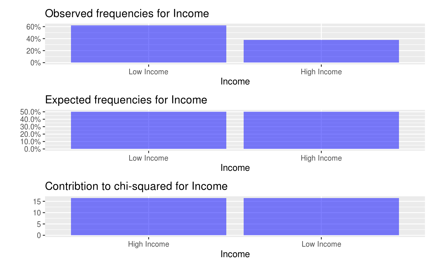
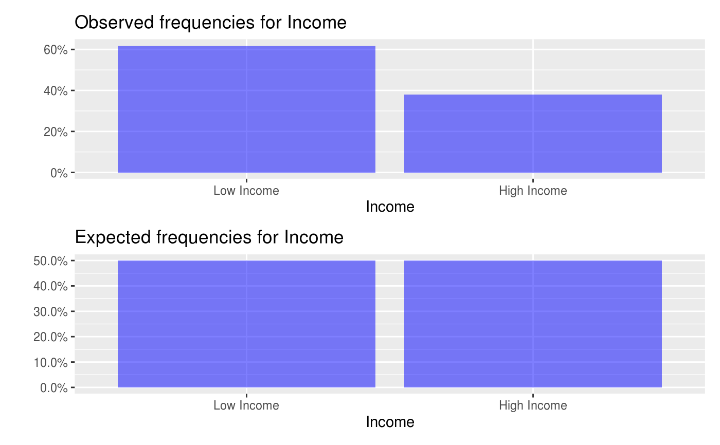
# S3 method for goodness
plot(x, check = "", fillcol = "blue", shiny = FALSE, custom = FALSE, ...)
Arguments
| x | Return value from |
|---|---|
| check | Show plots for variable var. "observed" for the observed frequencies table, "expected" for the expected frequencies table (i.e., frequencies that would be expected if the null hypothesis holds), "chi_sq" for the contribution to the overall chi-squared statistic for each cell (i.e., (o - e)^2 / e), and "dev_std" for the standardized differences between the observed and expected frequencies (i.e., (o - e) / sqrt(e)) |
| fillcol | Color used for bar plots |
| shiny | Did the function call originate inside a shiny app |
| custom | Logical (TRUE, FALSE) to indicate if ggplot object (or list of ggplot objects) should be returned. This option can be used to customize plots (e.g., add a title, change x and y labels, etc.). See examples and http://docs.ggplot2.org for options. |
| ... | further arguments passed to or from other methods |
Details
See https://radiant-rstats.github.io/docs/basics/goodness for an example in Radiant
See also
goodness to calculate results
summary.goodness to summarize results