Visualize data using ggplot2 https://ggplot2.tidyverse.org/
visualize(
  dataset,
  xvar,
  yvar = "",
  comby = FALSE,
  combx = FALSE,
  type = ifelse(is_empty(yvar), "dist", "scatter"),
  nrobs = -1,
  facet_row = ".",
  facet_col = ".",
  color = "none",
  fill = "none",
  size = "none",
  fillcol = "blue",
  linecol = "black",
  pointcol = "black",
  bins = 10,
  smooth = 1,
  fun = "mean",
  check = "",
  axes = "",
  alpha = 0.5,
  theme = "theme_gray",
  base_size = 11,
  base_family = "",
  labs = list(),
  xlim = NULL,
  ylim = NULL,
  data_filter = "",
  shiny = FALSE,
  custom = FALSE,
  envir = parent.frame()
)
Arguments
| dataset | Data to plot (data.frame or tibble) |
|---|---|
| xvar | One or more variables to display along the X-axis of the plot |
| yvar | Variable to display along the Y-axis of the plot (default = "none") |
| comby | Combine yvars in plot (TRUE or FALSE, FALSE is the default) |
| combx | Combine xvars in plot (TRUE or FALSE, FALSE is the default) |
| type | Type of plot to create. One of Distribution ('dist'), Density ('density'), Scatter ('scatter'), Surface ('surface'), Line ('line'), Bar ('bar'), or Box-plot ('box') |
| nrobs | Number of data points to show in scatter plots (-1 for all) |
| facet_row | Create vertically arranged subplots for each level of the selected factor variable |
| facet_col | Create horizontally arranged subplots for each level of the selected factor variable |
| color | Adds color to a scatter plot to generate a 'heat map'. For a line plot one line is created for each group and each is assigned a different color |
| fill | Display bar, distribution, and density plots by group, each with a different color. Also applied to surface plots to generate a 'heat map' |
| size | Numeric variable used to scale the size of scatter-plot points |
| fillcol | Color used for bars, boxes, etc. when no color or fill variable is specified |
| linecol | Color for lines when no color variable is specified |
| pointcol | Color for points when no color variable is specified |
| bins | Number of bins used for a histogram (1 - 50) |
| smooth | Adjust the flexibility of the loess line for scatter plots |
| fun | Set the summary measure for line and bar plots when the X-variable is a factor (default is "mean"). Also used to plot an error bar in a scatter plot when the X-variable is a factor. Options are "mean" and/or "median" |
| check | Add a regression line ("line"), a loess line ("loess"), or jitter ("jitter") to a scatter plot |
| axes | Flip the axes in a plot ("flip") or apply a log transformation (base e) to the y-axis ("log_y") or the x-axis ("log_x") |
| alpha | Opacity for plot elements (0 to 1) |
| theme | ggplot theme to use (e.g., "theme_gray" or "theme_classic") |
| base_size | Base font size to use (default = 11) |
| base_family | Base font family to use (e.g., "Times" or "Helvetica") |
| labs | Labels to use for plots |
| xlim | Set limit for x-axis (e.g., c(0, 1)) |
| ylim | Set limit for y-axis (e.g., c(0, 1)) |
| data_filter | Expression used to filter the dataset. This should be a string (e.g., "price > 10000") |
| shiny | Logical (TRUE, FALSE) to indicate if the function call originate inside a shiny app |
| custom | Logical (TRUE, FALSE) to indicate if ggplot object (or list of ggplot objects) should be returned. This option can be used to customize plots (e.g., add a title, change x and y labels, etc.). See examples and https://ggplot2.tidyverse.org for options. |
| envir | Environment to extract data from |
Value
Generated plots
Details
See https://radiant-rstats.github.io/docs/data/visualize.html for an example in Radiant
Examples
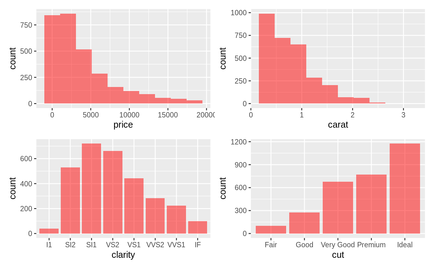
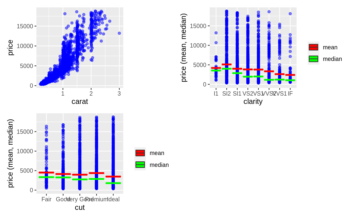
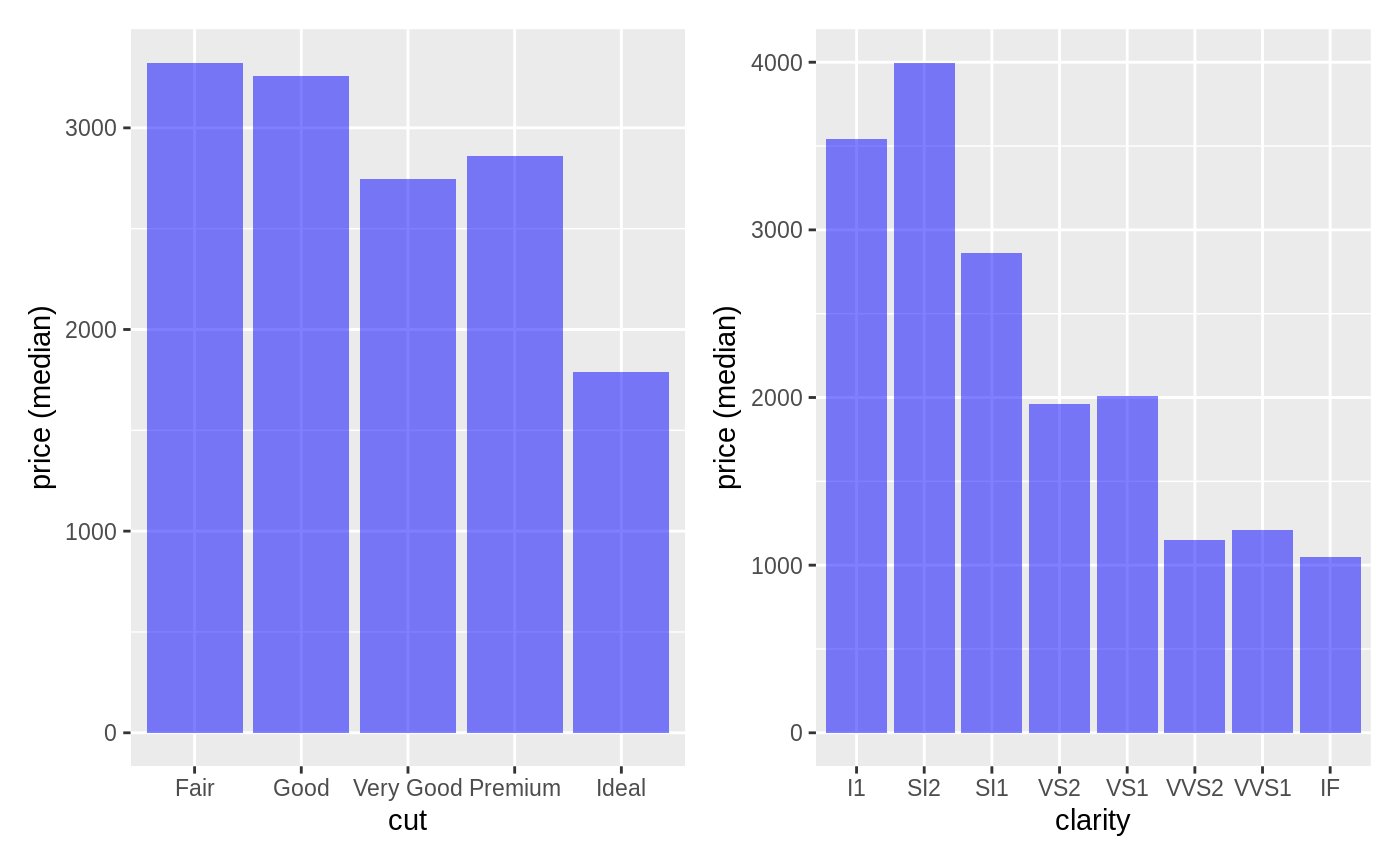
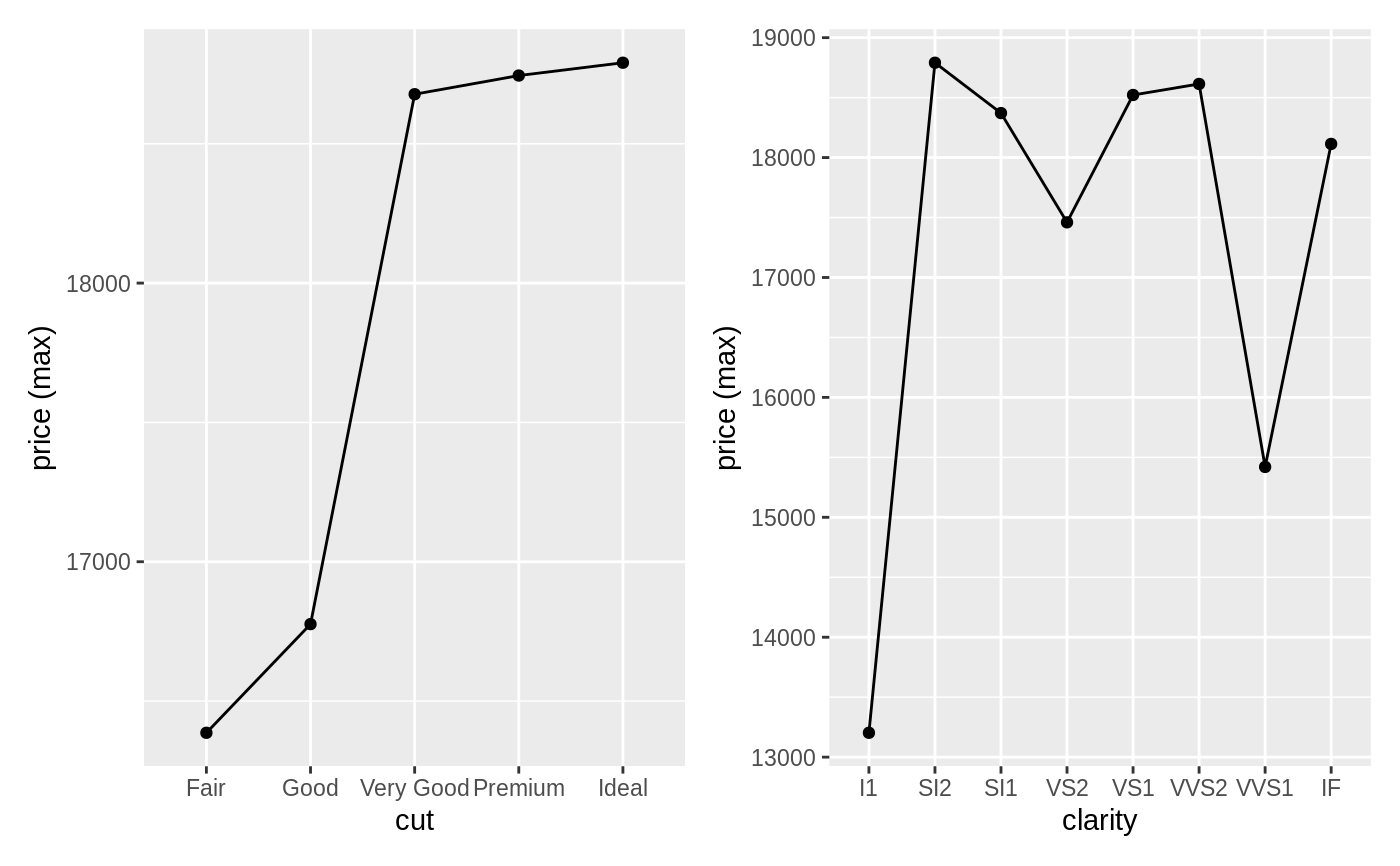
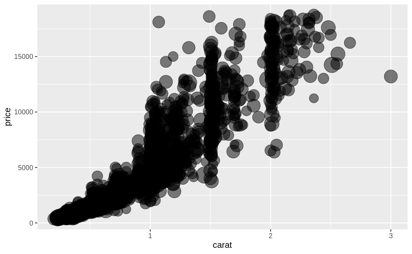
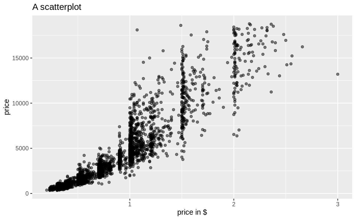
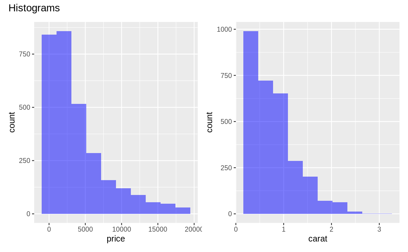
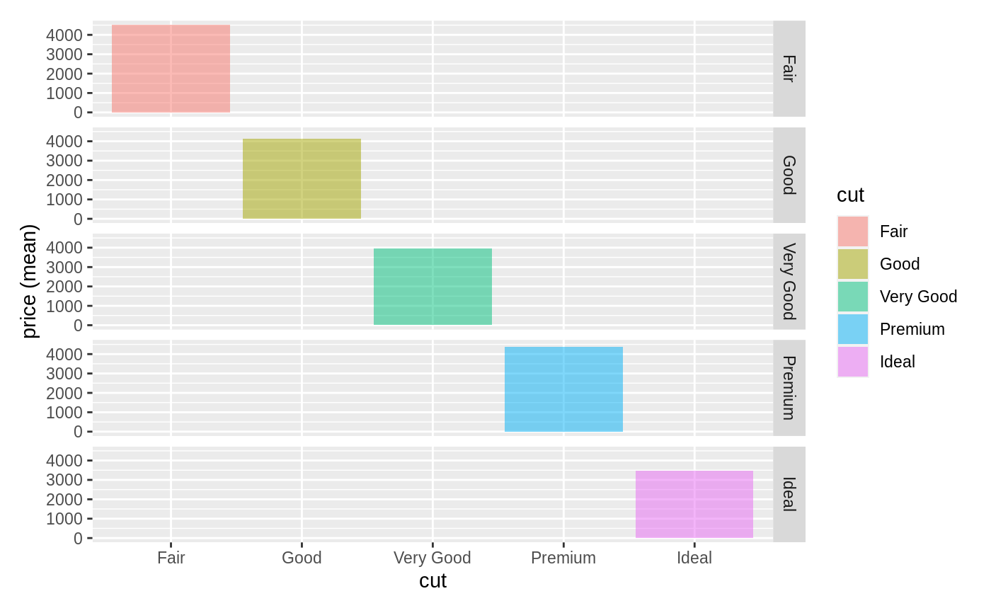
visualize(diamonds, "price:cut", type = "dist", fillcol = "red")visualize(diamonds, "carat:cut", yvar = "price", type = "scatter", pointcol = "blue", fun = c("mean", "median"), linecol = c("red","green"))visualize(diamonds, yvar = "price", xvar = "carat", type = "scatter", size = "table", custom = TRUE) + scale_size(range = c(1, 10), guide = "none")visualize(diamonds, yvar = "price", xvar = "carat", type = "scatter", custom = TRUE) + labs(title = "A scatterplot", x = "price in $")visualize(diamonds, xvar = "price:carat", custom = TRUE) %>% wrap_plots(ncol = 2) + plot_annotation(title = "Histograms")visualize(diamonds, xvar = "cut", yvar = "price", type = "bar", facet_row = "cut", fill = "cut")