Plot method for model.predict functions
# S3 method for model.predict
plot(
  x,
  xvar = "",
  facet_row = ".",
  facet_col = ".",
  color = "none",
  conf_lev = 0.95,
  ...
)
Arguments
| x | Return value from predict functions (e.g., predict.regress) |
|---|---|
| xvar | Variable to display along the X-axis of the plot |
| facet_row | Create vertically arranged subplots for each level of the selected factor variable |
| facet_col | Create horizontally arranged subplots for each level of the selected factor variable |
| color | Adds color to a scatter plot to generate a heat map. For a line plot one line is created for each group and each is assigned a different color |
| conf_lev | Confidence level to use for prediction intervals (.95 is the default) |
| ... | further arguments passed to or from other methods |
See also
predict.regress to generate predictions
predict.logistic to generate predictions
Examples
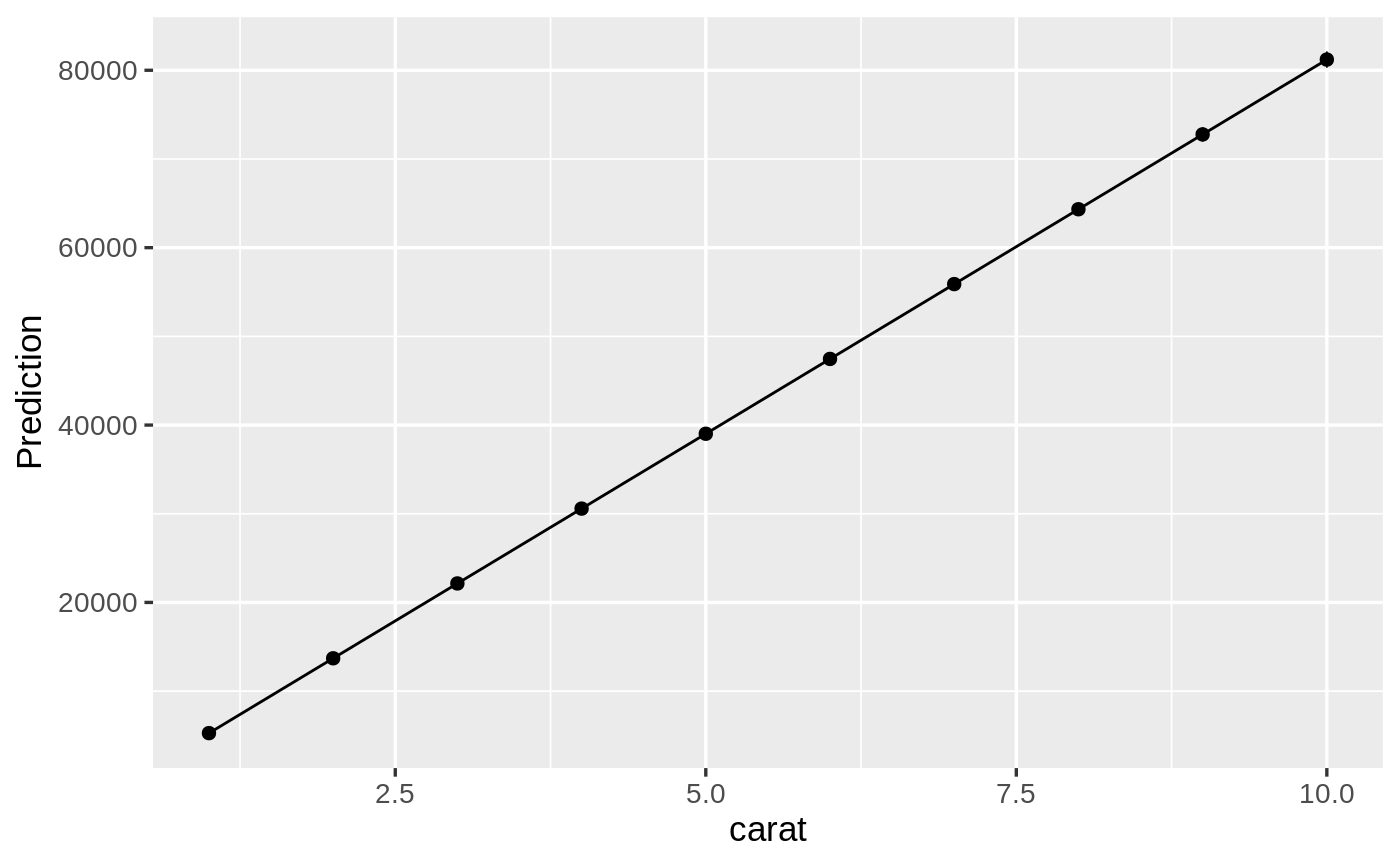
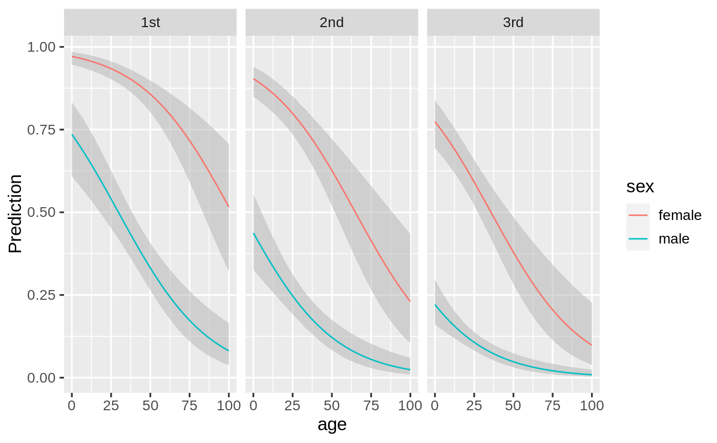
regress(diamonds, "price", c("carat", "clarity")) %>%
  predict(pred_cmd = "carat = 1:10") %>%
  plot(xvar = "carat")logistic(titanic, "survived", c("pclass", "sex", "age"), lev = "Yes") %>%
  predict(pred_cmd = c("pclass = levels(pclass)", "sex = levels(sex)", "age = 0:100")) %>%
  plot(xvar = "age", color = "sex", facet_col = "pclass")