Data > Pivot
Create pivot tables to explore your data
If you have used pivot-tables in Excel the functionality provided in the Data > Pivot tab should be familiar to you. Similar to the Data > Explore tab, you can generate summary statistics for variables in your data. You can also generate frequency tables. Perhaps the most powerful feature in Data > Pivot is that you can easily describe the data by one or more other variables.
For example, with the diamonds data loaded, select
clarity and cut from the
Categorical variables drop-down. The categories for the
first variable will be the column headers but you can drag-and-drop the
selected variables to change their ordering. After selecting these two
variables, and clicking on the Create pivot table button, a
frequency table of diamonds with different levels of clarity and quality
of cut is shown. Choose Row, Column, or
Total from the Normalize by drop-down to
normalize cell frequencies or create an index from a summary statistic
by the row, column, or overall total. If a normalize option is selected
it can be convenient to check the Percentage box to express
the numbers as percentages. Choose Color bar or
Heat map from the Conditional formatting
drop-down to emphasize the highest frequency counts.
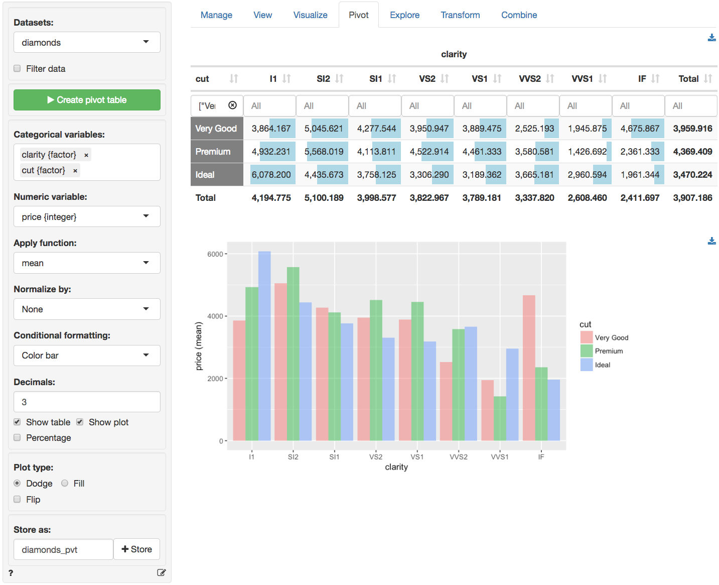
It is also possible to summarize numerical variables. Select
price from the Numeric variables drop-down.
This will create the table shown below. Just as in the
Data
> View tab you can sort the table by clicking on the column
headers. You can also use sliders (e.g., click in the input box below
I1) to limit the view to values in a specified range. To
view only information for diamonds with a Very good,
Premium or Ideal cut click in the input box
below the cut header.
Below you will find a brief description of several functions
available from the Apply function dropdown menu. Most
functions, however, will be self-explanatory.
ncalculates the number of observations, or rows, in the data or in a group if aGroup byvariable has been selected (nuses thelengthfunction in R)n_distinctcalculates the number of distinct valuesn_missingcalculates the number of missing valuescvis the coefficient of variation (i.e., mean(x) / sd(x))sdandvarcalculate the sample standard deviation and variance for numeric datamecalculates the margin of error for a numeric variable using a 95% confidence levelpropcalculates a proportion. For a variable with only values 0 or 1 this is equivalent tomean. For other numeric variables it captures the occurrence of the maximum value. For afactorit captures the occurrence of the first level.sdpropandvarpropcalculate the sample standard deviation and variance for a proportionmepropcalculates the margin of error for a proportion using a 95% confidence levelsdpopandvarpopcalculate the population standard deviation and variance
You can also create a bar chart based on the generated table (see image above). To download the table in csv format or the plot in png format click the appropriate download icon on the right.
Note that when a categorical variable (
factor) is selected from theNumeric variable(s)dropdown menu it will be converted to a numeric variable if required for the selected function(s). If the factor levels are numeric these will be used in all calculations. Since the mean, standard deviation, etc. are not relevant for non-binary categorical variables, these will be converted to 0-1 (binary) variables where the first level is coded as 1 and all other levels as 0.
Filter data
Use the Filter data box to select (or omit) specific
sets of rows from the data to tabulate. See the help file for
Data
> View for details.
Store
The created pivot table can be stored in Radiant by clicking the
Store button. This can be useful if you want do additional
analysis on the table or to create plots of the summarized data in
Data
> Visualize. To download the table to csv format
click the download icon on the top-right.
Report > Rmd
Add code to
Report
> Rmd to (re)create the pivot table by clicking the
icon on the bottom
left of your screen or by pressing ALT-enter on your
keyboard.
If a plot was created it can be customized using ggplot2
commands (e.g.,
plot(result) + labs(title = "Pivot graph")). See
Data
> Visualize for details.
R-functions
For an overview of related R-functions used by Radiant to create pivot tables see Data > Pivot